BCN Més is an independent monthly newspaper about Barcelona's local culture. Reaching their 50th issue they were looking for a redesign, something fresh but which continued to fit their editorial line: fun and provocative yet thoughtful and involved. The idea was to find a look that was bold and quirky but also clean and direct. Also, they needed a layout that was flexible, capable of accommodating large features next to small columns or illustration blurbs, all of which could be easily replaceable from issue to issue. The only design constraints were to keep the format and its duotone colour. Lena Wiget –editor and Art Director– and I worked hand in hand on redistributing the content in order to get the right reading flow.
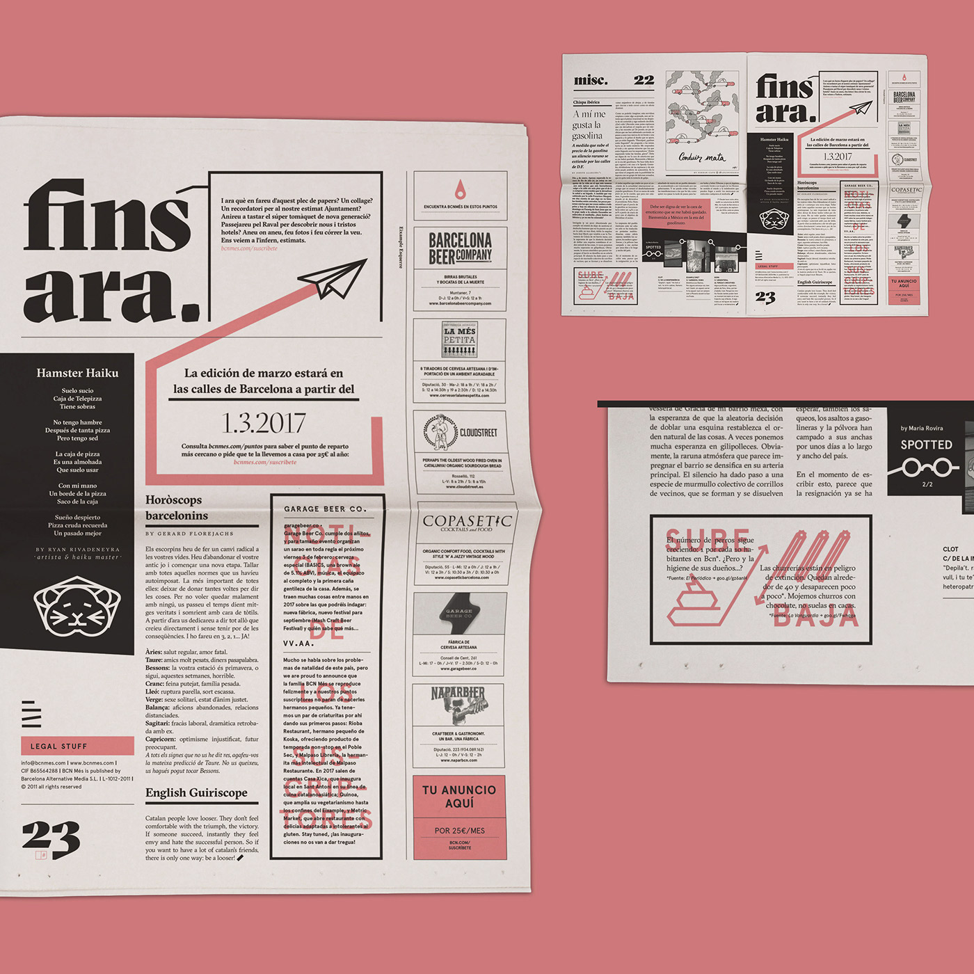
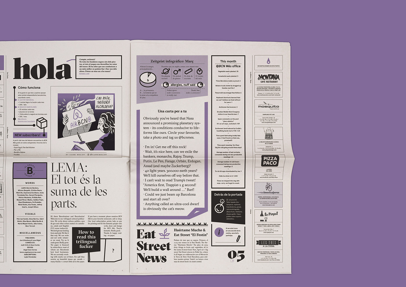
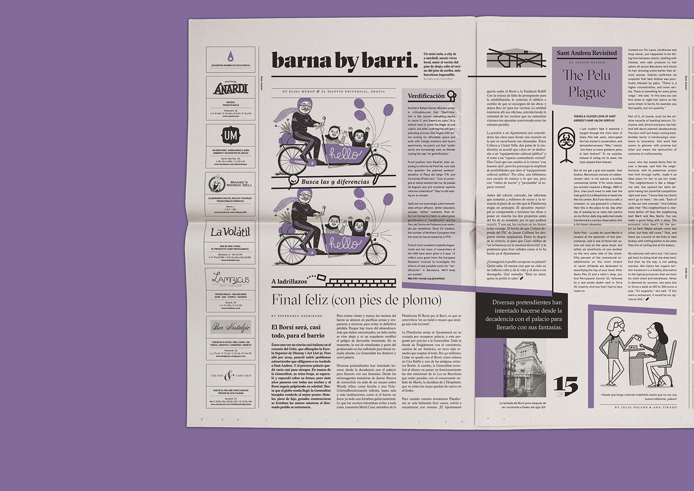
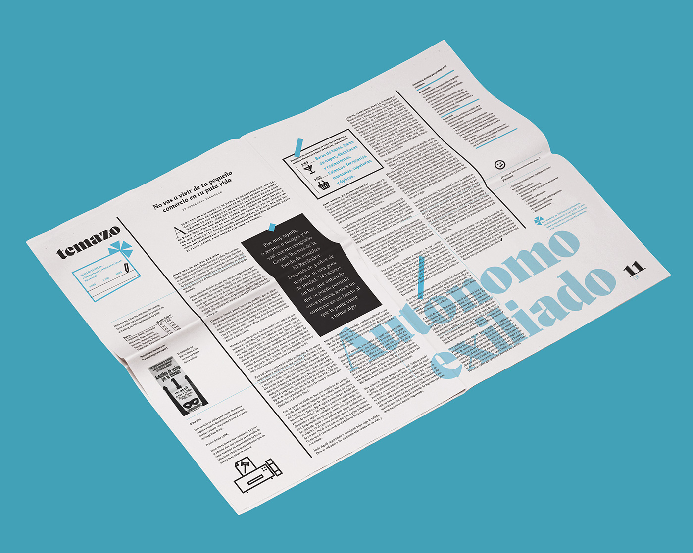
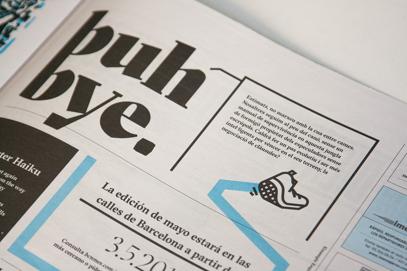
The core design concept was to establish a new identity for the magazine, which would also become the tool to both divide and illustrate regular sections and columns. Since the newspaper is trilingual (Catalan, Spanish & English), we chose 3 different stroke widths: a very fine one, a medium one and an extra bold one. The fine stroke would be used as a section subdivider, as secondary text underlining, and as the stroke for very small icons –such as page number indicators or credits–. The medium one would be used on section divisions, important text underlining and as the stroke for the regular icons –such as the ones which would illustrate columns and sections–. Finally, the thick stroke would be used to break entire areas of a spread, to highlight and underline important sections and, on rare occasion, illustrate wide areas in a bold fashion. On occasion, the thick stroke would also replace certain key accent marks, such as on the cover or main feature.
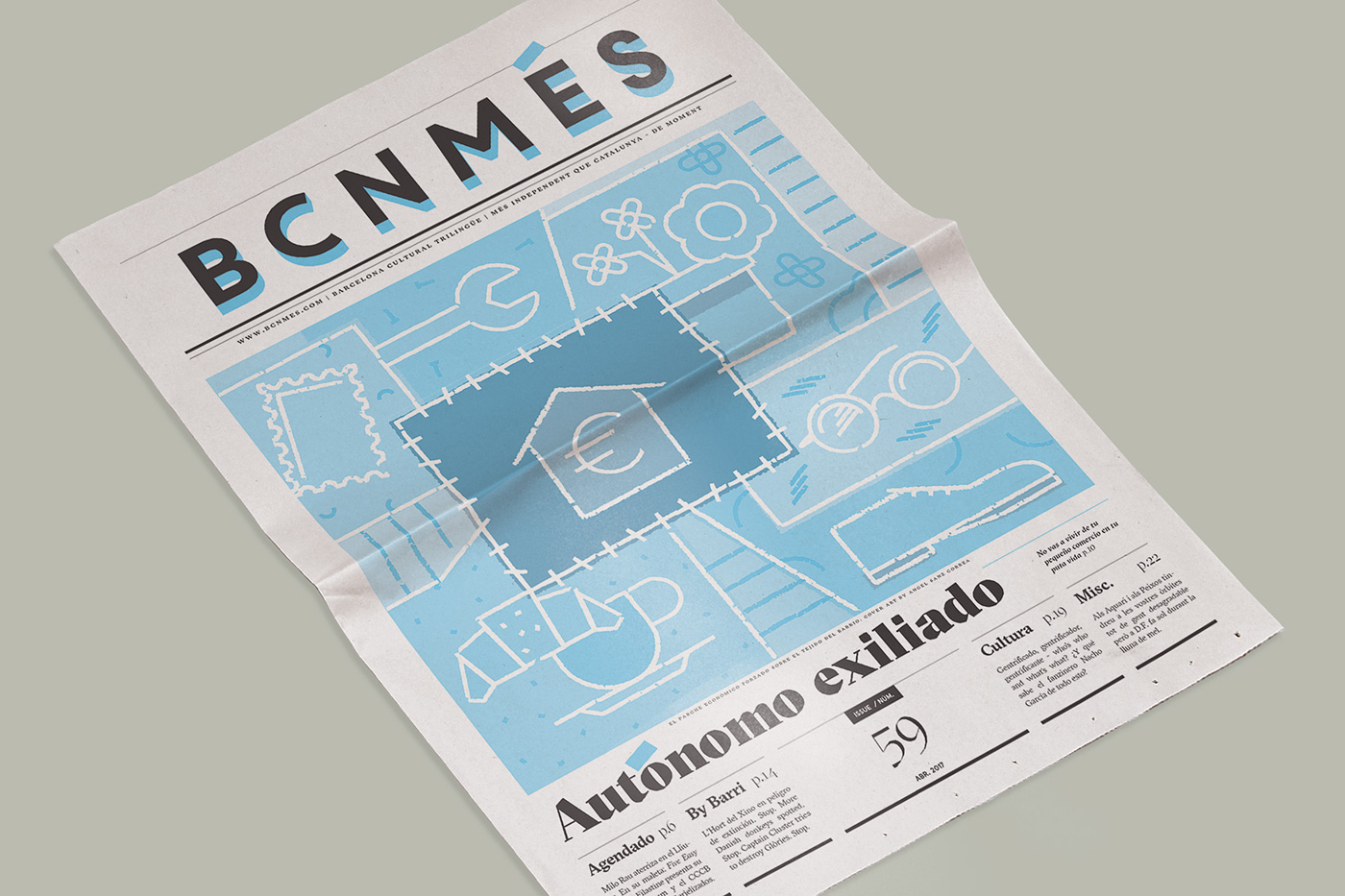
Besides the strokes, the font became the second identity-pillar. We chose a modern masterpiece: GT Sectra, an Egyptian family with a lot of personality, perfectly suited for the magazine's content. Its angled calligraphic finishings would dictate the way in which the whole magazine was designed: the sections and its dividers would become slanted, and so would the icons and illustrations. Finally, this asymmetric approach was applied to the new magazine logo, where the accent on the word "Més" would carry this slanted stroke to the cover, tying together the whole magazine style.

Finally, since each magazine's issue was to be printed with a different color (besides black), we chose a monthly one which would suit the mood at the time of the year. It would also create a color wheel throughout the year, beginning with pink in February and ending with red on December.
Full credits of the BCN Més staff:
Joe Littenberg & Lena Wiget (editing & publishing) - Judit Ortiz (proofreading) - Luján Fernández (subscriptions).
Joe Littenberg & Lena Wiget (editing & publishing) - Judit Ortiz (proofreading) - Luján Fernández (subscriptions).